Best Exterior Paint Colors for Tudor Homes
Tudor homes are the most architecturally constrained style to paint — the stucco panels, half-timber framing, and steep cross-gabled rooflines create a built-in color map you must honor. The stucco body gets a warm cream or tan, the half-timbers stay dark brown or black, and the front door is your one chance to introduce a jewel tone. Get the timber-to-stucco contrast right and a Tudor practically paints itself.
What Makes Tudor Homes Unique
Tudor Revival homes were built primarily in the 1920s–40s and remain some of the most recognizable houses in America. The defining features are steeply pitched cross-gabled roofs (often with front-facing gables), decorative half-timbering on the upper story or gable ends, stucco or brick infill between the timbers, prominent chimneys, and arched or rounded doorways. The half-timber framing is the signature element — those dark wood (or wood-look) bands against a lighter stucco field create the pattern that makes a Tudor instantly identifiable. Exterior materials include stucco, brick (often in a warm red or brown), stone accents around the entry, and slate or dimensional shingle roofing. The color strategy is dictated by the architecture: stucco panels are the body color, timbers are the contrast color, and everything else supports that relationship.
Top Color Palettes for Tudor Homes
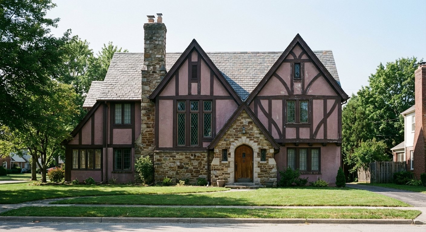
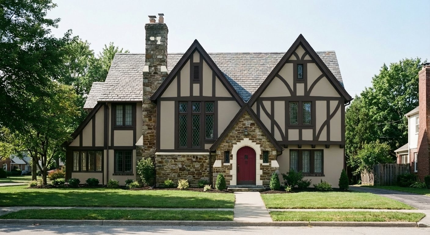
Classic Tudor
Accessible Beige stucco with Black Fox half-timbers is the most historically faithful Tudor palette. The warm beige reads as aged plaster — authentic to the medieval English homes these Revivals were modeled on. Black Fox is a warm dark brown that's more period-accurate than true black for the timbers. The Fireweed door adds a muted, jewel-toned red that glows in the arched entry without competing with the timber pattern above.
Try on your houseWarm Cream Tudor
Roycroft Vellum is a richer, more golden cream than Accessible Beige — it makes the stucco panels feel like illuminated parchment, especially in afternoon light. Turkish Coffee on the timbers is the deepest warm brown in the SW catalog, creating maximum contrast without resorting to black. The Rookwood Dark Green door is the English manor house choice: a deep forest green that reads as heritage and wealth.
Try on your houseStately Tudor
Kilim Beige pushes the stucco into warmer, sandier territory — it pairs naturally with Tudor homes that have red or brown brick on the lower story. Iron Ore on the timbers is crisper and cooler than Black Fox, creating a more defined graphic contrast against the warm stucco. The Naval door is an unexpected but historically grounded choice — deep blue doors appeared on English Tudor homes and read as formal and distinguished.
Try on your houseModern Tudor
Dover White brings the stucco into brighter, more contemporary territory while still reading as warm cream rather than stark white. Tricorn Black on the timbers is the boldest contrast option — it sharpens the half-timber pattern into a graphic, almost modern expression of the traditional form. The Cavern Clay door is the modern twist: terracotta reads as warm, grounded, and current without abandoning the earthy palette Tudors demand.
Try on your houseColors to Avoid on Tudor Homes
Never paint the half-timbers a light color — white, cream, or light gray timbers on a Tudor kill the contrast that defines the entire style. The timber-to-stucco contrast is the architectural DNA of a Tudor home. Reversing it (dark stucco, light timbers) or eliminating it (matching timbers to stucco) erases what makes the house recognizable. Timbers must always be the darkest element on the facade.
Tudor stucco panels should read as warm plaster or stone — not modern concrete. Cool grays like Repose Gray, Passive, or Mindful Gray create a contemporary vibe that fights the medieval English character of the style. Stick to warm beiges, creams, and tans for the stucco. The warmth is what makes the dark timbers feel like natural wood rather than graphic paint.
Tudor arched doorways are designed for depth and shadow, not shock value. A hot pink, electric blue, or bright orange door turns the entry into a carnival attraction that clashes with the stately character above. Jewel tones work (deep red, forest green, navy) because they have the richness and saturation that matches the Tudor's weight. Bright colors lack that substance.
Tips for Choosing Colors for Your Tudor Home
- Your half-timbers dictate the entire palette. Choose the timber color first (dark brown or black), then select a stucco color that contrasts warmly against it, then pick a door color that complements both. Working in this order — timbers, stucco, door — prevents the most common Tudor painting mistakes.
- If your Tudor has brick on the lower story, treat it as a fixed element and pull your stucco and timber colors from its undertones. Red-brown brick calls for warm cream stucco (Accessible Beige, Roycroft Vellum). Cooler brown brick can handle a slightly sandier stucco (Kilim Beige). Never let the stucco and brick clash — they sit right next to each other.
- Stain or paint the decorative vergeboards (the trim along the gable edges) the same color as the half-timbers. These elements are architecturally part of the timber framework, and painting them a different color breaks the visual logic of the Tudor pattern.
- Consider the stone or masonry around your entry arch. Most Tudors have stone surrounds on the front door that can't be painted. Your door color needs to complement this stone — test samples directly against it. Deep red against warm stone looks regal; deep red against cool gray stone can look awkward.
See these colors on your Tudor home
Upload a photo of your house and preview any of these palettes in under 30 seconds — free.
Try PaintVue FreeFrequently Asked Questions
What color should Tudor half-timbers be?
Can you paint Tudor stucco white?
What color front door for a Tudor house?
How do you paint a Tudor home with brick and stucco?
Should I paint or stain Tudor timbers?
Explore Tudor Color Palettes
See Also
Best Colors for Colonial Homes · Best Colors for Ranch Homes · Best Colors for Craftsman / Bungalow Homes · Best Colors for Split-Level Homes · Best Colors for Cape Cod Homes · Best Colors for Mid-Century Modern Homes · Best Colors for Farmhouse Homes · Best Colors for Contemporary Homes · Best Colors for Mediterranean Homes