Best Exterior Paint Colors for Contemporary Homes
Contemporary homes trade ornamentation for geometry — flat roofs, asymmetric facades, floor-to-ceiling glass, and mixed material cladding define the style. Color palettes follow the same principle: fewer colors, bigger impact. High-contrast pairings of dark bodies with light trim, or all-white schemes with a single bold door, let the architecture speak without distraction.
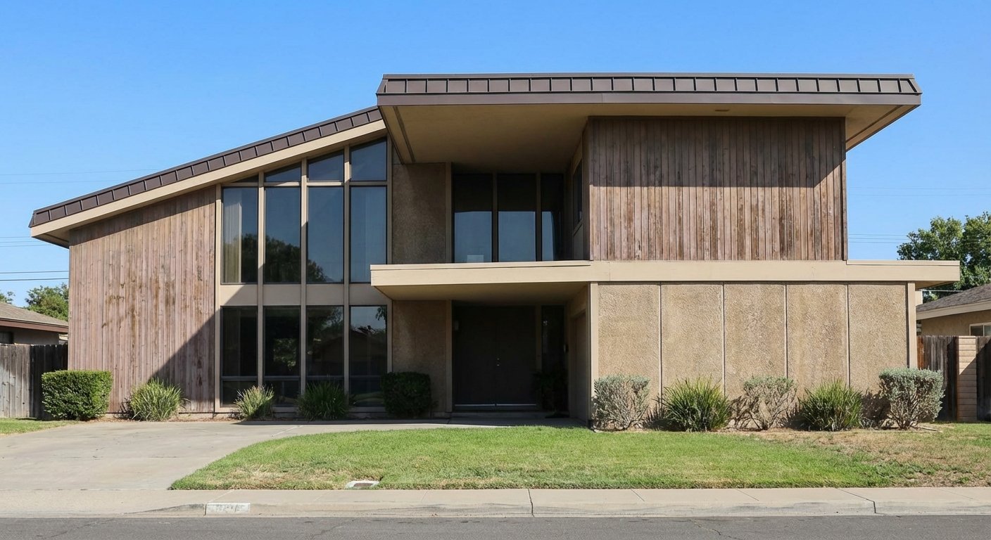

What Makes Contemporary Homes Unique
Contemporary homes encompass a broad range of modern design built from the 1970s to today, distinguished from Mid-Century Modern by their sharper geometry, larger window walls, and willingness to mix materials aggressively. Defining features include flat or mono-pitched roofs, asymmetrical facades, cantilevered volumes, expansive glass, and exterior cladding that often combines two or three materials — metal panels, fiber cement, natural wood, stucco, or stone — on the same elevation. The color approach is minimalist by nature: contemporary architecture relies on material contrast and geometric shadow lines to create visual interest, so the paint palette stays tight. One or two colors plus a door accent is the standard. High contrast (dark body, light trim) and monochromatic schemes (all-white, all-charcoal) both work because the building form is strong enough to carry either.
Top Color Palettes for Contemporary Homes
Dark Contemporary
Tricorn Black is the ultimate statement of confidence — an all-dark contemporary home lets the building's geometry cast shadows and create depth on its own. Alabaster trim on window frames and fascia provides just enough relief to define the edges. A Cavern Clay door introduces the only warm element, and its terracotta tone prevents the scheme from feeling cold. This palette works best on homes with large glass areas that provide natural contrast.
Try on your houseCharcoal & White
Cyberspace is the more nuanced alternative to true black — this dark blue-gray reveals depth and undertone in changing light, making the facade feel alive rather than flat. Extra White trim creates crisp, graphic lines at every material transition and window edge. The Naval door is subtle: dark enough to blend with the body from a distance but distinct enough up close to mark the entry clearly.
Try on your houseAll-White Modern
Pure White on a contemporary home creates a gallery-like effect — every shadow line, cantilever, and window mullion becomes visible as architectural sculpture. The Iron Ore trim defines edges without breaking the monochromatic plane. The entire personality of this palette rests on the front door: Reflecting Pool provides a bold teal pop that's modern, unexpected, and impossible to miss against the white field.
Try on your houseWarm Modern
Iron Ore replaces the more common black with a warmer, slightly brown-toned dark that prevents the stark coldness some contemporary homes suffer from. Shoji White trim is cream-warm rather than blue-cool, reinforcing the approachable feel. The Red Bay door is an architect's trick: a deep red reads as sophisticated and intentional against a warm dark body, not kitschy the way it might on a lighter home.
Try on your houseColors to Avoid on Contemporary Homes
Colonial greens, Craftsman earth tones, and farmhouse whites with black trim all carry historical associations that contradict contemporary architecture's forward-looking identity. A Roycroft Suede body with Java trim on a flat-roofed contemporary home looks like a costume — the style demands colors as modern as its geometry.
Contemporary architecture relies on geometric shadow lines and material contrast for visual interest — not color variety. Adding a fourth or fifth paint color fights the minimalist principle the style is built on. If your facade feels bland with two colors, the issue is material contrast or landscaping, not a missing accent color.
Colors like Accessible Beige, Latte, and Tony Taupe as full-body choices make contemporary homes look like builder-grade tract houses rather than intentional architecture. The mid-tone beige range lacks the commitment of either extreme — go dark for drama or light for sculpture, but don't split the difference on a contemporary home.
Tips for Choosing Colors for Your Contemporary Home
- Let your material palette guide your color count. If your contemporary home already mixes wood cladding, metal panels, and stucco, those materials are providing visual variety — the paint just needs to unify or frame them. One paint color plus your material contrast is often enough.
- The front door is the one place to introduce personality. On a monochromatic or high-contrast contemporary home, a bold door color (teal, deep red, bright yellow) functions as an art piece. Choose a color that contrasts with both the body and trim for maximum impact.
- Consider how your home looks at night. Contemporary homes with large glass areas glow from interior light after dark — the exterior color becomes a frame for the illuminated interior. Dark body colors create a more dramatic nighttime effect than light ones.
- Coordinate with your hardscape. Contemporary homes often have visible concrete driveways, steel railings, and stone or composite decking that are essentially permanent. Your paint palette needs to work with these fixed elements — a warm-toned house on a cool gray concrete pad creates an unresolved tension.
See these colors on your Contemporary home
Upload a photo of your house and preview any of these palettes in under 30 seconds — free.
Try PaintVue FreeFrequently Asked Questions
What is the best color for a contemporary home?
Should a contemporary house be all one color?
Can I paint a contemporary home a bright color?
How do I choose paint colors for a contemporary home with mixed materials?
Is black too dark for a house?
Explore Contemporary Color Palettes
See Also
Best Colors for Colonial Homes · Best Colors for Ranch Homes · Best Colors for Craftsman / Bungalow Homes · Best Colors for Split-Level Homes · Best Colors for Cape Cod Homes · Best Colors for Mid-Century Modern Homes · Best Colors for Farmhouse Homes · Best Colors for Tudor Homes · Best Colors for Mediterranean Homes