Best Exterior Paint Colors for Mid-Century Modern Homes
Mid-Century Modern homes are all about clean geometry, flat or low-slope rooflines, and an honest relationship between indoor and outdoor space. Period-appropriate color palettes lean earthy and muted — desert tones, olive greens, warm tans — with a single accent color on the fascia board or feature wall providing the only punch. The goal is understated confidence, not decoration.
What Makes Mid-Century Modern Homes Unique
Mid-Century Modern homes were built from the late 1940s through the 1970s, influenced by architects like Eichler, Neutra, and the Case Study program. The defining features are horizontal massing with flat or very low-pitched rooflines, wide eave overhangs with exposed fascia boards, large expanses of glass (floor-to-ceiling windows and sliding doors), open carports instead of enclosed garages, and an emphasis on merging indoor and outdoor living. Exterior materials typically include vertical board-and-batten siding, brick, stucco, and sometimes a mix of all three on different facade planes. The fascia board running along the roofline is a signature detail — it's often painted an accent color, functioning as a visual frame for the entire house. Color choices should honor the period's restraint: muted, nature-derived tones applied in flat or matte finishes.
Top Color Palettes for Mid-Century Modern Homes
Desert Modern
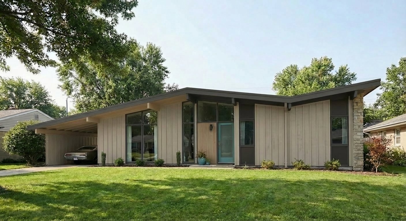
Pewter Green and Camelback are the period-perfect MCM duo — sage green and warm tan were among the most popular builder colors in 1950s–60s tract homes. Alabaster on the fascia and trim provides the crisp horizontal line that defines the roofline. This palette looks like it's been on the house since it was built, which is exactly the point. Authentic without feeling dated.
Try on your houseWarm Earth MCM
Urbane Bronze is one of the most versatile Mid-Century body colors — it's dark enough to feel grounded but warm enough to avoid the cold edge that kills the MCM vibe. Latte on the fascia board and feature wall acts as an accent that reads period-appropriate. The white trim keeps the horizontal lines sharp and defined against the warm body.
Try on your houseBold Contrast MCM
Cyberspace is the modern MCM owner's answer to the question of going dark without going black. This dark blue-gray is moody and architectural, letting the home's geometry do the talking. The Cavern Clay accent on the fascia board or a feature wall panel is the signature move — it's the terracotta pop that screams mid-century without a single piece of furniture visible. Warm white trim keeps it from going gothic.
Try on your houseLight & Airy MCM
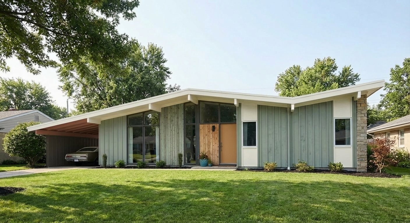
Accessible Beige lets the architecture speak for itself — this warm neutral disappears into the background and lets the roofline, window walls, and landscaping take center stage. Iron Ore trim is bold for a light body house, but on a Mid-Century Modern it reads as intentional, outlining the fascia and eave details like a pencil drawing. The Reflecting Pool door adds a teal pop that's undeniably mid-century.
Try on your houseColors to Avoid on Mid-Century Modern Homes
Mid-Century Modern architecture is about simplicity and restraint. Three-plus accent colors, contrasting shutters on every window, and decorative color banding all fight the clean lines these homes were designed around. If your palette needs more than three colors, you're overcomplicating it.
Heritage reds, forest greens with cream trim, and warm brown earth-tone schemes that work on Colonials and Craftsmans look wrong on Mid-Century Moderns. These palettes carry historical associations that contradict the forward-looking, post-war optimism MCM architecture represents. Stay in the mid-century color world: desert tones, olive, teal, charcoal.
Mid-Century Modern homes were designed for flat and matte surfaces — the architecture depends on clean, non-reflective planes to create its signature look. High-gloss siding or trim catches light unevenly on the long, flat wall planes and creates a plasticky appearance that fights the natural, honest-materials ethos of the style. Use flat or satin for siding and eggshell for trim at most.
Tips for Choosing Colors for Your Mid-Century Modern Home
- The fascia board is your secret weapon. On a Mid-Century Modern, the wide fascia running along the roofline is the single most impactful color decision. Paint it an accent color (Cavern Clay, Camelback, Reflecting Pool) to frame the entire house from above. This one detail instantly reads as intentional, period-appropriate design.
- Think about the roofline as a design element, not just a roof. MCM homes have proportionally more visible roof and fascia than any other style. A flat white roof with dark fascia reads completely differently than a gravel roof with a warm tan fascia. Coordinate your palette with what's overhead.
- If your MCM has a carport instead of a garage, its underside is a visible surface. Paint the carport ceiling and support posts as part of the palette — leaving them raw or mismatched looks unfinished. The carport framing is architectural detail on an MCM, not utility.
- Use flat or matte finishes for the body and satin at most for trim. The flat planes and horizontal lines of Mid-Century architecture were designed to be seen in matte — glossy finishes create reflections and highlights that break up the clean geometric surfaces these homes depend on.
See these colors on your Mid-Century Modern home
Upload a photo of your house and preview any of these palettes in under 30 seconds — free.
Try PaintVue FreeFrequently Asked Questions
What are authentic mid-century modern exterior colors?
Should I paint my mid-century modern house white?
What color should I paint my mid-century fascia board?
Can I paint a mid-century modern house a dark color?
How do I pick colors for a mid-century modern with mixed materials?
Explore Mid-Century Modern Color Palettes
See Also
Best Colors for Colonial Homes · Best Colors for Ranch Homes · Best Colors for Craftsman / Bungalow Homes · Best Colors for Split-Level Homes · Best Colors for Cape Cod Homes · Best Colors for Farmhouse Homes · Best Colors for Contemporary Homes · Best Colors for Tudor Homes · Best Colors for Mediterranean Homes