Best Exterior Paint Colors for Craftsman / Bungalow Homes
Craftsman homes celebrate handcrafted detail — exposed rafter tails, tapered columns on stone piers, and deep covered porches that beg for rich, earthy color palettes. Unlike most styles where dark trim is a mistake, Craftsman architecture was designed for it, making this one of the few house styles where your trim can be darker than your body.
What Makes Craftsman / Bungalow Homes Unique
Craftsman homes (also called Bungalows) emerged from the Arts & Crafts movement of the early 1900s as a reaction against Victorian excess. Every detail serves a purpose: the low-pitched gabled roof with wide, unenclosed eave overhangs exposes decorative rafter tails and knee braces. The signature front porch — often full-width — features tapered square columns sitting on substantial stone or brick piers that ground the home visually. Materials are deliberately natural: wood clapboard or shingle siding, river stone or clinker brick for columns and chimneys, and natural wood details throughout. These material textures demand paint colors that feel organic — not slick, not synthetic, not too polished.
Top Color Palettes for Craftsman / Bungalow Homes
Classic Craftsman
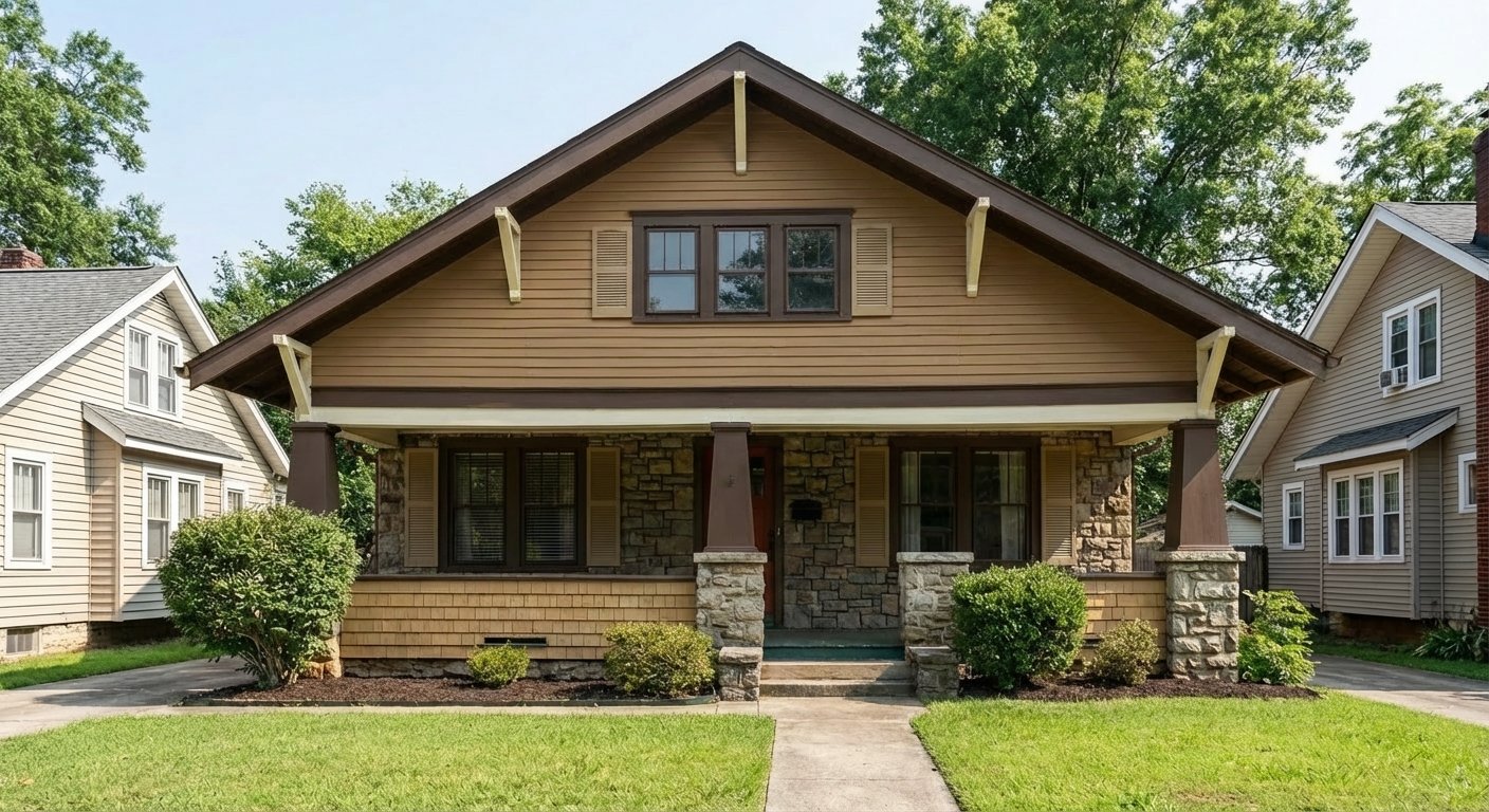
Roycroft Suede is the quintessential Craftsman body color — a warm leather-brown that feels like it was mixed from the same earth as the stone piers below. Java trim is darker than the body, which would be wrong on most styles but is absolutely authentic here. The Roycroft Copper Red door adds the warmth the Arts & Crafts movement celebrated, while Roycroft Vellum softens the porch ceiling overhead.
Try on your houseForest Craftsman
Rosemary captures the deep, mossy green that Craftsman architects used to merge their homes with the surrounding landscape. Roycroft Suede trim is warmer than the green body and creates the layered, organic contrast these homes demand. The Fireweed door is a muted, brownish red — nothing cherry or fire-engine — that complements the earthy scheme without shouting.
Try on your houseMoody Craftsman
For Craftsman owners who want drama. Urbane Bronze is a warm, complex dark that shifts between brown and charcoal depending on the light — far more interesting than flat black. Black Fox trim deepens the shadows under the eaves and around the rafter tails. The Polished Mahogany door adds a reddish-brown glow that rewards a closer look. This palette works best on Craftsmans with substantial stone columns that provide visual weight at the base.
Try on your houseWarm Stone Craftsman
Tony Taupe bridges the gap between the stone piers and wood siding that define Craftsman construction — it's literally the color of warm fieldstone. Java trim grounds the composition, and the Rookwood Dark Green door is a nod to the natural world the Arts & Crafts movement revered. Accessible Beige as an accent lightens the porch ceiling and window sash without the jarring coldness of white.
Try on your houseColors to Avoid on Craftsman / Bungalow Homes
Colors like Repose Gray or Passive clash with the warm wood and stone details that define Craftsman architecture. The blue and purple undertones in cool grays create a jarring disconnect between the paint and the natural materials underneath — the house ends up looking like a modern build wearing a Craftsman costume.
Unlike Colonials where white trim is classic, Craftsman architecture was designed for warm, dark, or earth-toned trim. Bright white trim on a Craftsman looks like a painting error — it fights the handcrafted, natural aesthetic and makes the eave details and rafter tails look pasted on rather than integrated.
Baby blue, lavender, mint green, and blush pink belong on Cape Cods, not Craftsmen. The Arts & Crafts movement was explicitly about substance, weight, and honest materials — delicate, candy-colored paints undermine the visual authority that makes Craftsman homes impressive.
Tips for Choosing Colors for Your Craftsman / Bungalow Home
- Don't try to match your paint to the stone piers — it never works and makes the stone disappear. Instead, choose body and trim colors that complement the stone's undertones. Warm stone (tan, gold, rust) calls for warm earth tones. Cool stone (blue-gray fieldstone) lets you use slightly cooler greens like Rosemary.
- Consider painting the front door and window sash a different color than the main trim. Craftsman homes traditionally used three or four colors: body, trim, sash, and accent. This layered approach rewards close inspection and honors the Arts & Crafts philosophy of intentional detail.
- Stain — don't paint — your rafter tails and knee braces if they're natural wood. These are signature Craftsman details meant to show wood grain and craftsmanship. Painting them robs the house of the handcrafted character the style was built on.
- Test colors against your porch columns. The tapered columns on stone piers are the visual anchor of a Craftsman's front elevation — if your body color fights the column material, the whole facade feels unresolved.
See these colors on your Craftsman / Bungalow home
Upload a photo of your house and preview any of these palettes in under 30 seconds — free.
Try PaintVue FreeFrequently Asked Questions
What are the most authentic colors for a Craftsman home?
Can you paint a Craftsman home a light color?
Should Craftsman trim be darker than the body?
What about the front porch ceiling on a Craftsman?
How many colors should I use on a Craftsman exterior?
Explore Craftsman / Bungalow Color Palettes
See Also
Best Colors for Colonial Homes · Best Colors for Ranch Homes · Best Colors for Split-Level Homes · Best Colors for Cape Cod Homes · Best Colors for Mid-Century Modern Homes · Best Colors for Farmhouse Homes · Best Colors for Contemporary Homes · Best Colors for Tudor Homes · Best Colors for Mediterranean Homes