Best Exterior Paint Colors for Split-Level Homes
Split-level homes present a unique color challenge: multiple facade planes at different heights that can either look disjointed and boxy or flow together as a cohesive design. The stacked levels, prominent front-facing garage, and staggered rooflines give you natural breakpoints to introduce complementary tones — making two-tone color schemes not just possible but ideal.
What Makes Split-Level Homes Unique
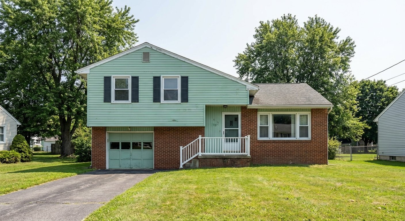
Split-level homes were built primarily in the 1950s–70s as a clever solution to sloped lots and growing families who needed more space without a larger footprint. The defining feature — two or three floor levels offset by half a story — creates a distinctive front facade with clearly separated upper and lower wall planes, often with different materials on each level. Most Split-levels have a prominent front-facing garage at the lowest level, a main entry at mid-height, and living spaces above. Common materials include brick veneer on the lower level with wood or vinyl siding on the upper, giving the home a built-in two-tone starting point. The challenge is making these stacked planes feel intentional rather than disjointed — and color is the single most effective tool for that.
Top Color Palettes for Split-Level Homes
Modern Two-Tone
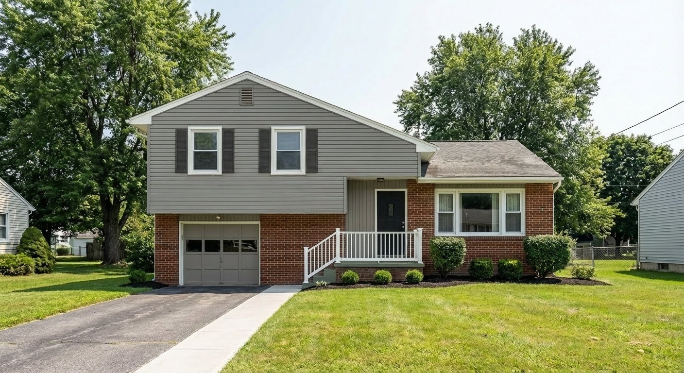
Gauntlet Gray on the upper level grounds the home with warm sophistication, while Alabaster on the lower level and garage lightens the base and keeps the house from feeling top-heavy. This palette uses the natural level break to create visual separation without clashing — the warm gray and warm white share undertones, so they read as a deliberate pairing, not two random colors stacked together.
Try on your houseWarm Contrast
Urbane Bronze on the upper siding paired with Dover White below is the Split-level equivalent of a tailored suit — the dark-over-light composition draws attention upward to the living spaces and away from the garage. The Cavern Clay door adds a warm mid-tone that bridges the two levels at the entry, exactly where the eye naturally lands.
Try on your houseEarthy Split
Pewter Green on the upper level with Shoji White below channels the natural, landscape-friendly palette that mid-century Split-levels were designed for. The deep sage reads grounded against trees and lawns while the warm white keeps the lower level open and clean. Roycroft Bronze Green on the door ties the two levels together with a color that splits the difference between the green and the white.
Try on your houseBold Navy Split
Naval on the upper level is a bold, confident choice that instantly modernizes a dated Split-level. The warm white lower level and trim prevent the navy from feeling heavy, and the contrast creates the visual separation these homes need without introducing a third competing color. A Red Bay door at the entry point punches through the palette with exactly the right amount of drama.
Try on your houseColors to Avoid on Split-Level Homes
Painting the whole Split-level one color emphasizes the boxy, stacked shape rather than disguising it. The level breaks become awkward horizontal lines with no visual logic. Split-levels are one of the few styles that genuinely benefit from two-tone palettes — use the natural level change as a design asset, not something to paint over.
Split-levels already have visual complexity from their staggered levels, mixed materials, and prominent garage. Adding four or more colors creates chaos — it draws attention to every seam and transition. Stick to two main colors (upper and lower) plus a door accent. Three colors maximum, including trim.
The front-facing garage on a Split-level is often the single largest visual element. Leaving it as a default white or painting it a contrasting color makes it dominate the facade. The garage door should match either the lower level siding or the trim — never be a standalone color that draws the eye down and away from the entry.
Tips for Choosing Colors for Your Split-Level Home
- Use the darker color on the upper level and the lighter color on the lower level. This dark-over-light composition makes the house feel more grounded and draws the eye upward toward the living spaces rather than down toward the garage — a common problem with Split-levels.
- Paint the entry-level facade (the middle section where the front door sits) the same color as the upper level. This visually connects the main living areas and creates a two-story effect that minimizes the split appearance.
- Match the garage door to the lower-level siding or trim — never make it a third color. On a Split-level, the garage already commands too much visual attention. Making it blend with its surrounding wall plane is the fastest way to improve curb appeal.
- Test your two chosen colors side-by-side in direct sunlight. Colors that look complementary on paint chips can clash at scale, especially at the level transition where they meet. Bring large samples and tape them at the actual break point on your facade.
See these colors on your Split-Level home
Upload a photo of your house and preview any of these palettes in under 30 seconds — free.
Try PaintVue FreeFrequently Asked Questions
How do I make my split-level look less boxy?
Should I paint the upper and lower levels different colors?
What color should I paint my split-level garage door?
Can I paint my split-level all one color?
How do I modernize a 1970s split-level exterior?
Explore Split-Level Color Palettes
See Also
Best Colors for Colonial Homes · Best Colors for Ranch Homes · Best Colors for Craftsman / Bungalow Homes · Best Colors for Cape Cod Homes · Best Colors for Mid-Century Modern Homes · Best Colors for Farmhouse Homes · Best Colors for Contemporary Homes · Best Colors for Tudor Homes · Best Colors for Mediterranean Homes