Best Exterior Paint Colors for Cape Cod Homes
Cape Cod homes are America's cottage — compact, symmetrical, and steeply gabled, with a charm that depends almost entirely on the interplay between body color, shutters, and a standout front door. Light, airy palettes keep the small scale feeling open and inviting, while the right shutter and door color transforms a simple form into a neighborhood icon.
What Makes Cape Cod Homes Unique
Cape Cod homes originated in 17th-century New England and remain one of the most common residential styles in the eastern United States. The hallmarks are a steeply pitched side-gabled roof (designed to shed snow), a symmetrical front facade with a centered entry, dormer windows on the upper half-story, and a compact 1 to 1.5-story profile that sits close to the ground. Exterior materials are almost always wood clapboard or cedar shingle siding — vinyl replacements are common on updated homes. What defines a Cape Cod's curb appeal is the trinity of body, shutters, and front door: the body sets the canvas, the shutters frame the windows (and are architecturally essential, not decorative), and the front door is the exclamation point. Get those three elements right and a Cape Cod practically glows.
Top Color Palettes for Cape Cod Homes
Coastal Cape Cod
Sea Salt is the quintessential Cape Cod body color — a blue-green gray that reads differently in every light, always leaning toward the ocean. Extra White trim keeps the cottage feeling crisp and well-maintained. The Naval front door is classic New England: bold enough to anchor the symmetrical facade without competing with the gentle body color. Dark shutters at Cyberspace frame every window like a picture.
Try on your houseWarm Silver Cape
Silver Strand is slightly warmer than Sea Salt, making it forgiving on Cape Cods that get harsh afternoon sun. Alabaster trim softens the contrast compared to bright white, giving the whole house a more relaxed feel. The Coral Reef door is the star — a warm, sun-bleached coral that feels welcoming and unexpected without being garish. This is the palette for Cape Cods that want personality.
Try on your houseGarden Cape Cod
Rainwashed captures that soft green-blue that makes Cape Cods feel like they've been there forever — settled into the landscape rather than sitting on top of it. Dover White trim is warmer than pure white and pairs beautifully with the green undertone. The Red Bay door is a classic cottage move — there's a reason red doors on white-ish Cape Cods are iconic. It's contrast that feels cozy rather than dramatic.
Try on your houseClassic Gray Cape
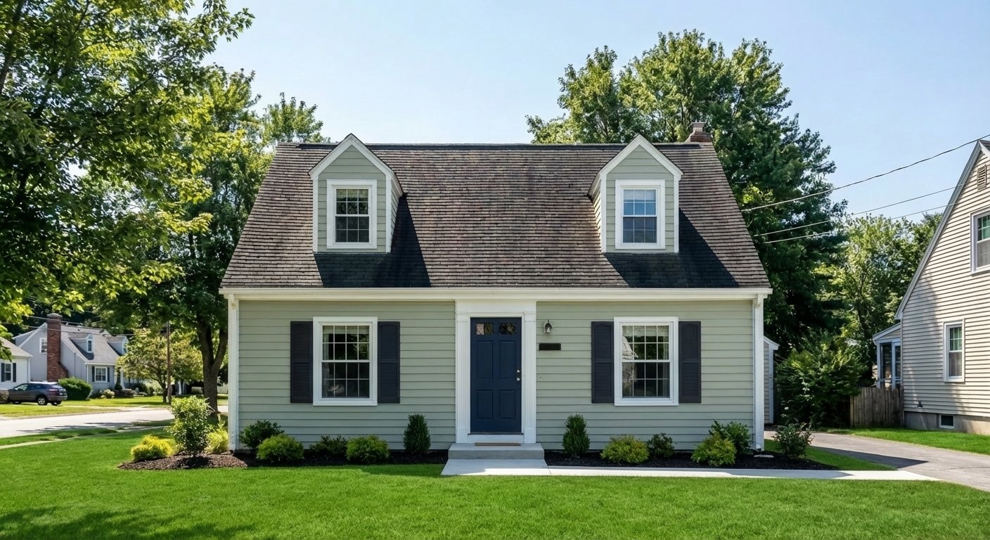
Silvermist is the reliable, goes-with-everything Cape Cod body color — cool enough to feel clean but warm enough to avoid looking sterile. Extra White trim keeps the lines sharp. The Rojo Dust door is a muted, earthy red-orange that warms up the cooler palette without the intensity of a true red. This is the safe, sophisticated choice that photographs beautifully and never goes out of style.
Try on your houseColors to Avoid on Cape Cod Homes
Tricorn Black, Inkwell, and other dark body colors overwhelm the small scale of a Cape Cod. What looks dramatic on a two-story Colonial looks like a cave on a 1.5-story cottage. Cape Cods need light to feel like themselves — dark body colors fight the compact, cheerful character the style is built on.
Removing shutters from a Cape Cod is like removing eyebrows from a face — the windows look exposed and the facade loses its defining character. Even if your shutters are in rough shape, replacing them is a better investment than painting around their absence. Shutter color should contrast with the body to frame each window clearly.
The black-house trend that works on modern Farmhouses and Contemporary homes falls flat on a Cape Cod. The cottage proportions and steep roofline are designed for lightness and charm — wrapping them in black creates a visual contradiction. The house reads as trying to be something it's not, and the small dormers and entry disappear into the dark facade.
Tips for Choosing Colors for Your Cape Cod Home
- Light body colors are your best friend on a Cape Cod. The compact 1.5-story profile reads small to begin with — dark colors make it feel smaller. Sea Salt, Silver Strand, Rainwashed, and Silvermist all keep the house feeling open and airy while providing more character than plain white.
- Invest in the front door. On a Cape Cod, the centered door is the single strongest focal point. A bold color — coral, red, yellow, or deep navy — transforms the entire curb appeal. Paint the door in a semi-gloss or high-gloss finish for extra impact.
- Match your dormers. The dormer windows on a Cape Cod's upper half-story should have the same shutter and trim treatment as the lower windows. Inconsistent color between levels makes the house look unfinished — the dormers are part of the symmetry, not afterthoughts.
- Consider your roof color before finalizing your palette. Cape Cod roofs are steeply pitched and highly visible, making up a large percentage of the facade. A charcoal roof limits your body color options differently than a brown or weathered cedar roof.
See these colors on your Cape Cod home
Upload a photo of your house and preview any of these palettes in under 30 seconds — free.
Try PaintVue FreeFrequently Asked Questions
What color shutters look best on a Cape Cod?
What is the best front door color for a Cape Cod?
Should I paint my Cape Cod white?
How do I make a small Cape Cod look bigger?
Can I use gray on a Cape Cod home?
Explore Cape Cod Color Palettes
See Also
Best Colors for Colonial Homes · Best Colors for Ranch Homes · Best Colors for Craftsman / Bungalow Homes · Best Colors for Split-Level Homes · Best Colors for Mid-Century Modern Homes · Best Colors for Farmhouse Homes · Best Colors for Contemporary Homes · Best Colors for Tudor Homes · Best Colors for Mediterranean Homes